Product review: Daytone Extra Fine Inks for Fountain Pens

I recently paid a visit to Daytone industries, Indore. I wanted to visit the manufacturing facility. However, the owner informed me that he wasn’t available for a walkthrough. So, we reserved it for a later date. However, I could not stop myself from buying their assorted collection of the ‘Extra Fine’ inks for fountain pens. Since I had reserved myself a visit, I also got a nice discount from them.

Even for the asking price of roughly 900 INR, a pack of fifteen colors of inks is a deal. However, you can get yourself the inks at much lesser prices on websites like Amazon and Flipkart.

The owner informed me that he was happy to see a steady increase in demand. And, within the last 5-10 years, he has seen a trend shifting in favor of using and soliciting the use of ink (or fountain) pens.

Here, in this post, I have sampled all fifteen inks for you. Some I really liked. Some I reserved for later use.

Most of the colors are matt finish and do not shade or sheen. However, some shading naturally occurs because of a single or double pass of ink.

I especially like that, at the price point those inks are sold, you can play around with different colors. I am using Chocolate, for instance in my Pilot Custom 823. It is a relatively cheap ink for a pricey pen—a rather unlikely combination. However, in the little time I used the combination, I changed the ink. So, I didn’t, purposely, let the ink dry within the pen. I’m really not sure how will the ink behave if the pen is left unused for a long time. But I’d prefer experimenting by using a pocket-friendly pen.

In daily use, I have found the inks to be pen friendly. The inks may not always be paper friendly, insomuch as they will require a fountain pen-friendly paper. You can view more writing samples on my Instagram feed:

  • Kanwrite Heritage inked with Cerulean Blue here
  • Pilot Custom 823 in Amber inked with Sapphire Blue here.

Let me know how you find this review.

Product Review: Pelikan 4001 Blau-Schwarz (Blue-Black) Ink

Sometimes, to beat the rather mundane blue and black ink colors of your fountain pen, the easiest escape is in using a combination of the two colors. And when the ink has iron-gall-like properties, it is all the more enough to amuse yourself with.

Shade and swab

The ink has a good, rich color and shades beautifully as you write through pages. It has the right combination of the extremes of blue-black. So, it goes from the liveliest of midnight blues to the smoothest shades of blue-grey.

This is a shading ink and not a sheening one. So, despite how much amount of ink I poured on the paper, I could not find any signs of either purple or blue.

Also, I find this to be correctly leaning toward the blue-grey side. There are a few blue-blacks that I find to be bluer (and sometimes, more blue-green-black) than just blue-black.

Even on the normal notebook and photocopy paper, I don’t see any signs of feathering or bleedthrough when writing. For reference, note that I am using a Broad nib for the writing sample.

Drying time and water resistance

The ink takes anywhere between 20-35 seconds to dry depending on your paper choice. On an everyday, photocopy paper, it took 15 seconds. But on a more fountain-pen-friendly paper, it took 30-ish seconds to dry.

Even though it is a bit on the drier side, I am a bit shocked (pleasantly, that is) to see that it still takes that much time to dry. The sample was left to dry for at least one full day before testing.

It is fairly water-resistant, which means it is relatively safe to use for your office work. I would not call it waterproof, but it has much better water resistance than some of the inks I have used in the past.

The ink might look darker in the photographs, but it (perfectly) leans towards blue.

Observations and conclusion

I have used it in two pens in which the ink has behaved completely differently. For the ink tests, I used my Magna Carta Denima (M) and Guider Medium Ebonite (B) on regular photocopy paper. In Denima, the shading didn’t come through.

When the nib was sufficiently wet, I got a dark shade. But when the nib was starving, I got a lighter shade. While this should be normal for any ink-paper-pen combination, I found that the ink dried faster in my Denima. I never had such an issue with my Denima before; it never skipped and I never had a hard start before. But now I do.

On the flip side, my Guider Medium Ebonite is a gusher. It has a broad nib that writes like it is a Double Broad. Although I tuned the nib a bit, I still see that the nib is sufficiently wet to produce darker shades of letters as I write.

What surprises me is that even though the ink is drier, it doesn’t behave so when I use it in a pen with a broad nib. I can safely conclude that that is so because almost all German pens use one-size broader nibs when compared with Japanese pens. So, a medium nib on a German pen will behave like a Broad nib on a Japanese pen.

To make up for this, I assume, Pelikan has made its Blue-Black just a little bit drier. And, therefore, it doesn’t misbehave on my Guider Medium that dons a Broad nib. I’d like to reserve this ink for my Guider pen, but I will buy a wetter ink for my Denima. Maybe it is time for me to try another blue-black ink. This time, though, I am thinking of buying Japanese ink. I think it will be Pilor Iroshizuku Shin-Kai.

Overall experience

I bought this ink from writeway.in. My shopping experience was smooth. The site didn’t charge me anything for nationwide shipping. Even though the 30ml bottle was a bit overpriced, I didn’t mind paying extra, since there wasn’t any minimum order price to qualify for free shipping.

Although, I will say I am a bit disappointed with the ink. It is a lot drier than I expected. But I still love how it brought one of my smoothest writers back into my pocket. What’s more? The ink made me learn an invaluable lesson: use German inks for pens with Broad or Double Broad nibs. 🙂

I will be curious to know your experience with the Pelikan inks, especially the 4001 series, Blau-Schwarz ink.
Happy writing.

Product Review: Kanwrite Heritage Fountain Pen and Krishna Lyrebird Turquoise Blue Ink

Ever since I’ve begun seriously cultivating my newfound hobby of collecting and using fountain pens, two things have happened, both of which were, sort of, but understood: my clarity of thoughts and handwriting have improved. But, those are in addition to the “wows” I receive when I flaunt my collection. Today’s post is about the latest addition to this collection: a Kanwrite Heritage.

For a combination, I chose the Pearl Green color and teamed it with the Krishna Lyrebird Everyday Turquoise Blue ink. This combination, I must say, has come out really well. Really well—worth the repetition, that is.

Built and Construction

The pen is made of good-quality acrylic. It is a bit on the heavier side, but the construction is such that the pen is balanced at the center when fully refilled. The pen is 14.1 cms in length when capped, 16.4 cms when posted, and 13.1 cms when uncapped.

The pen comes with a piston-filler mechanism, which is easy to use and clean. You can open the nib unit and see through to the very end of the pen with the piston sitting flush. I will also say that the piston mechanism doesn’t leave room for ink or air to seep through. I tried cleaning the pen once; not a single droplet seeped through to the other side of the piston.

Nib

I got a Broad one, but it feels more like Medium to Broad. On occasions, I got Broad strokes, but mostly it leans more toward the Medium width. For comparison, I wrote using my Guider Medium ebonite, which, too, uses a Broad nib. But, the Guider one writes more between Broad and Double-Broad.

This nib on the Kanwrite Heritage is Kanpur Writers’ in-house international #6 equivalent steel nib, and I must say that it performs really well out of the box. The nib unit is interchangeable, and for reference, I also have an Ultra-flex that goes from Extra Fine to Double Broad. The flex is nice and springy, but the nib and feed need to be tuned for scratchiness and flow, respectively.

Both nib units for the Kanwrite Heritage (the Ultra-flex nib and Broad nib ones) come with an ebonite feed. And, within the time I have used it, I didn’t experience even a single instance of the ink drying overnight with the pen standing upright in my pen stand. Overall, it is a nib unit that is easy to install, easier to clean, and easiest to get used to.

Ink

I’ve used Krishna Super Rich series inks before. So, I wasn’t new to the brand or the experience. However, I will say that even though the Lyrebird series is a tad cheaper, it is in no way any lesser than the Super Rich series in terms of quality. I liked the ink saturation, the flow, and the drying time. Only a few shades of ink can truly be called turquoise, and the Lyrebird Everyday Turquoise Blue Ink is one. It sits comfortably between blue and green.

The “every day” in the name of the ink justifies that the color doesn’t irritate you. It doesn’t pinch you in the eye, so you can use it every day. It is bright enough to appear lively yet sufficiently dark to appear correctly on your paper. The ink is a sibling of Monsoon Sky from Krishna Ink’s Super Rich series.

For comparison, I dropped a few drops of both colors. Turquoise, by definition, is a step or two towards green. Monsoon Sky is exactly what its name suggests. Lyrebird has better contrast, but Monsoon Sky spreads better. Also, the base tone of Monsoon Sky, I found, to be toward a much lighter shade of blue.

That shade difference aside, it is the inks’ behavior that made me curious. You can tell that the Super Rich Series is a bit more watery and might trickle down into pages that follow. Also, in my observations, the Lyrebird ink dries more quickly. So, it must be better for calligraphy or pen art.

Where to Buy

I bought the pen from The Pen World (http://www.thepenworld.com). It has one of the most sorted collections for those starting with this hobby of collecting or using fountain pens. The prices are affordable, but the range goes beyond the scope of my willingness to invest for now. You could, alternatively, buy the pen directly from Kanpur Writers’ website, www.kanpurwriters.com, as it might have a nib option that might interest you more. Either way, your purchase decision will be in sorted hands.

Speaking of sorted, I think it is time to sort things to their conclusion. 🙂

Conclusion

I don’t have any complaints; in fact, I’m in love with this pen. From the time I inked it, the pen has never skipped once. The ink flow is butter smooth, and the ink doesn’t irritate my eyes. In terms of the aesthetics, it is one of the most sorted (there I go again!) combinations of pen and ink color.

Product Review: Guider Medium Ebonite Handmade Pen

I had always wanted to write with an ink pen. More so, a handmade pen. After all, anything handmade is, more often, made with a little bit of extra care. My search, as of now at least, has concluded with something that fits my pocket, budget, and requirements. It is the Medium Ebonite Handmade pen from Guider Pen Works that I am talking about. Let’s delve.

Built and Construction

The pen seems built solidly. It’s just one single piece of ebonite, crafted like a cigar with a difference that the cap is a bit larger than the body.

The top finial is crowned to extrude out of the clip. Fashion is subjective, and so is the way this pen is crafted, for it looks a lot like the Montblanc Meisterstuck. But that’s not important, anyway. This pen looks like it will age well.

The pen comes with a butter-smooth nib (spoiler alert) and a Schmidt international converter. I had seen them ship an extra nib, but I guess that’s applicable for only ED pens. Mine came with a German nib unit, which is costly. And I am more than happy with what I got.

Here are a few specifications of the pen:

  • Length of the pen (closed) – 144 mm
  • Length of the pen (open and unposted) – 127 mm (including the nib)
  • Length of the Grip Section – 18 mm

The best part is that the threads on the section are unobtrusive. If anything, they help you grip better. The pen opens in about 3 and a half turns, which isn’t bothersome either.

Nib and Nibbling

A better part of describing a pen should be about how it performs. And, we could hardly keep ourselves from talking about such great nibs. Yet, when Mr. G Laksham Rao told me that all his pens in the ebonite series came with German nibs, it lent the required food for thought. What is the use of “food for thought” if it doesn’t make you hungry to explore any further?

For such reasons, I got myself a Schmidt #6 in Broad (update: Lakshman Garu told me later that it is #5 and not #6). The nib is sufficiently wet and transfers words effortlessly on paper as it glides smoothly as a hot knife glides through butter. The nib is so smooth that it demands me to write faster. In my case, it yearned for me to nibble bites from my thoughts one after another. I wrote five long pages of nonsense the moment I picked and unscrewed the pen.

The feed is plastic. And until you reach the break-in stage for this pen, which should be as early as a couple refills, the pen will tend to skip a bit. But then it could also be because of the combination of the thirsty Broad nib, the plastic feed, and the quick-drying Parker Quink.

If you want, you can order the nib unit separately and interchange it easily by unscrewing the old one and replacing it with the new one.

The Right and the Write

The pen is a lightweight champion. Even though it is front-heavy, the weight appears to be balanced evenly throughout the section and the barrel. It is also that the weight is just right enough for you to not bother about pressing down for the ink to flow: the pen writes well under its own weight.

I ordered the pen via the WhatsApp number of G Laksham Rao himself. He shared with me the entire list of pens he made. From that collection, I selected this all-black design. He had it shipped immediately. In less than seven days, I had received my order. He has been facing issues with procuring ebonite because of the COVID-19 situation, but he confesses his honest commitment of investing 100%  of his heart and soul into fulfilling all orders he receives. In his own words, “it is a matter of pride. I cannot spoil my father’s name.” They have been making pens for the last seventy-five years, and he wants to continue to do it for as long as possible.

I am happy that I, as a customer, could be a part of his long journey. After I received my order, he gave me a call to ask if I was OK with it. He took so much care that he even asked me to return the pen to him, and he would customize it to suit my requirements. For a newbie FP enthusiast like me, that is more than I had bargained for!

Conclusion and How to Buy

The pen makes a permanent place for itself right from the first word it wrote. I’d recommend an Indian handmade ebonite fountain pen to every possible person. Only a few companies chose to listen to their customers. Still, fewer treats their customers as respectfully as Lakshman Garu.

You can just give him a call and talk to him about fountain pens. At least for me, his care and passion poured out from my cellphones microphones as he continued to describe why he had sent what he had. I could well have begun and concluded this review in one sentence: despite not receiving what I had wanted, this pen continues to receive the praise it truly deserves.

Here’s how you can order a pen from him:

  1. Go through their website: https://guiderpen.com 
  2. Choose a pen category.
  3. Give him a call or WhatsApp him on 09390163779. He usually responds immediately.
  4. Select the pen of your choice and pay.
  5. He ships the pen to you.
  6. Write away to glory.

I hope you like the review and his craftsmanship.

Happy writing.

Product Review: Submarine 939 Fountain Pen

God knows I have been itching to review a fountain pen for a long time. And when I did get the one that fit my budget, they sent me one with a Fine tip. Damn!

And, so began my review even before I had filled the pen with ink. But the support was kind enough to let me know that Submarine Pens didn’t deal with Fine nibs and were as shocked as I was. They kindly agreed to send me a Medium nib, which should be on its way right now.

So, here’s the review.

The pen is of brass and is a tad on the heavier side for my liking. The build quality is solid. And all parts feel they there made to measure. If the pen didn’t have the pattern, I reckon it would be a lot slippery to hold. So, good, thoughtful design.

The opening mechanism is pull-and-push. I like the tactile and acoustic feedback of the ‘click.’ The cap’s finial has a studded Swarovski element, which adds a nice touch to the look. I’d be OK without it, but I know a lot of Indians would love to have some embellishment on the pen. After I ordered the pen, they called to ask if I’d like to personalize it, which I did. The font size and style selection were theirs. Yet, my name just shines through: no pun intended. 🙂

The nib, as I mentioned, is an Indian Fine tip and should sit between the western Fine and Indian Medium nib. Considering my shaky hand, I’d prefer either a Medium or Broad nib, but even this nib is a joy to write with. It is a platinum-tipped nib that’s made of stainless steel and feels more toward being sturdy than flexible. For a Fine nib, the sweet spot is relatively large enough to write at any angle.

Reverse writing is possible. This pares down to two things: the nib is smooth, and the ink flows through the feed’s channels. The website advertises the pen comes with a Medium, dual-tone nib, but I got a Fine, gold-colored nib. A Fine nib has its advantages. One, the ink dries faster. Two, feathering and bleed through to the other side of the paper reduces.

One more thing! The nib is smooth for its first use but I reckon it will soon break in. Until then, the flow through the feed’s channels will not be consistent and the ink’s color will not come through.

The feed and converter are plastic, and the pen came supplied with two cartridges of company-specific ink. I had an old bottle of Parker Quink Blue, so I chose not to purchase Submarine’s ink, which was about twice as expensive (twice as good?). Anyway, the two supplementary cartridges are sufficient to judge the ink’s quality if I compare it with the Parker’s.

For a section and grip that’s carved out of brass, the grip is a perfect combination of shine and comfort. I can write for a long time without fatigue. The pen’s weighted toward the tip, and you will have to adjust the weight even when you might have posted the pen. Usually, I don’t post my pen. So, I will continue to try different combinations to get the best writing.

In tests limited to my knowledge, exposure, and technique, Parker’s Quink won. I had used a regular 60~70 GSM printer paper. Through the first, second, and third passes, Quink flew better and was more saturated. But I used a cartridge for Submarine ink and the converter for Parker’s Quink. So, I’d give a point to the converter because it did the job it is meant to do.

I have a doctor’s handwriting (Sorry, doctors!), and the Fine tip doesn’t lend a lasting impression in that regard.

Should you try this pen? Why not. Especially given that they acknowledged that they accidentally sent a Fine nib and would happily replace it for free. Customer service goes a long way in assuring repeat purchases. After all, you can sell a product only once! After which, the product has to sell itself.

I got the pen for 600 rupees, plus shipping. To buy the pen, use this link: https://www.submarinepens.com/product/939-fountain-pen/

So, that’s my first review of a fountain pen. Please pardon my handwriting, and let me know if I missed anything.

Happy writing.

Product Review: Sennheiser HD 350BT Headphones
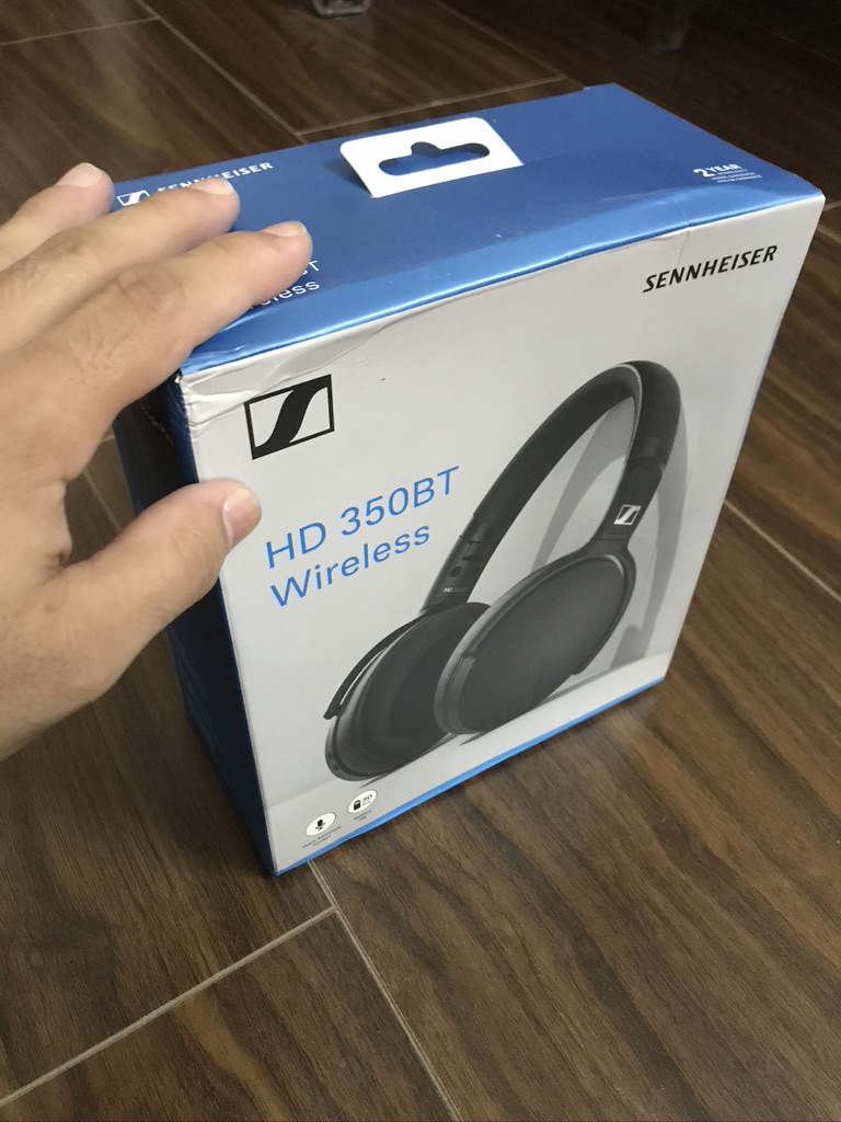
When you are working from home for a stretch of as long as 10 hours a day, for over 3 months, you need a good pair of headphones. Not because it is a “need” but because, sometimes, the “want” graduates to a higher level of need.

With a lot of good choices around, the confusion is but understood. But considering the factors that I had on my mind, I bought myself the Sennheiser HD 350BT. And, yes, the recommendation from my colleague had a role to play in the purchase decision. Thank you, Narissa, for the recommendation, and The Sound Factor (special thanks to Milind and Loknath), for shipping it to me.

AF75C803-A6F4-4350-AA4B-63B0FA71C84E_1_105_c

Here’s my detailed review:

The Background

The headphones are the newer siblings of the outgoing (outgone?) Sennheiser 4.40BT NC headphones. And for the price, the newer sibling comes out—about 2.5K INR cheaper than the current price—I wasn’t expecting the company to provide NFC for pairing. Not because the company cannot do it, but it doesn’t make sense to add an extra feature if it doesn’t add significantly to the overall value. The truth is that to sell the product (or any product), you have to either reduce the price or increase the value proposition. In this case, Sennheiser has gotten rid of the non-essential features, reduced the price, and given us a more rounded value proposition.

The Contents

In the box, you get the headphones, the charging cable, and the documentation.

The Build Quality and Ergonomics

I’d begin with talking about the oblong earcup sizes: they are millimeter-on-millimeter perfect for my ears, but might not suit everyone’s ears. It seems that the company has taken the economic approach for even the earcup sizes. The removable cushioning on the earcups is on the softer side. I would’ve liked a bit more padding.

DD80510A-6DF4-42F1-A36F-31C3A6A9F4DE_1_105_c

The headphones are made almost entirely out of plastic—including the extension and hinges. That is good for two reasons: it keeps the cost in check and reduces the weight on your head. The clamping force isn’t bothersome for my head size, and the underside of the headband has semi-soft padding. So, wearing it for long(er) duration—I assume—wouldn’t be a problem.

BA46BFD9-09CA-400A-9A0D-0C683AFB50AF_1_105_c

All buttons are placed on the right ear cup. While I like the tactile feedback on the volume rocker, I dislike the multi-function button’s feather-touch mechanism. You can move it back and forth and press it. Even when I intended to press the button, a slightest of lateral movement would change the song. They could have provided one more button; I’d be OK with it. But, I did get used to the overall placement rather quickly.

There is a dedicated button for the voice assistant, which adds a nice/needed feature based on how much you use it. Since I will be at my work desk on most occasions when I wear these headphones, this will hardly add any convenience to me.

D5C26743-B450-40DC-99F4-DECD7EAC0CF2_1_105_c

I wouldn’t call these headphones “cheap,” even if those may be one of the cheapest from Sennheiser. I don’t know if I’d ever go out to buy a pair of headphones that expensive ever again. First, I’d use those only for work. Second, a heapdhone is a tool—a means to an end. Had I been into gaming or media production, I’d have happily invested in a more expensive, better made, or feature-packed one.

C34C6421-54A0-4F69-85CE-E177D1A52790_1_102_o

Overall, it is a nicely built pair, which isn’t brittle and doesn’t creak or squeak when you pick it up to wear.

The Battery Life and Connectivity

Full charging takes about a couple of hours. And because these come with a 300 mAh battery life of up to 30 hours, I assume I might have to charge it, at the maximum, twice a week.

0970CACA-B204-4264-BA07-E46EEC2F052C_1_102_o

In terms of the sound codecs, the Sennheiser HD 350BT support SBC, AAC, AptX, and AptX Low Latency for stable connection and near-perfect audio-video synchronization. For me, the icing on the cake is the Bluetooth 5.0 connectivity, so it works very well with my MacBook Pro. Yes, there is a lag when I move into another room, but the connection remains rock-solid, nonetheless.

The headphones come with a USB-C connection, and you get a sufficiently long USB-A to USB-C cable in the box for charging. This is a handy addition considering most people use phones with the same port. So they wouldn’t need to carry an extra cable.

68A2929E-A10B-439A-BC70-DF32B9021163_1_105_c

There are two microphones on the right earcup. In my testing, I found that they not only suppressed the background noise but also amplified my voice. While this may sound like a value proposition, the resulting voice sounded fake or raspy. Besides, this model does not have Active Noise Cancellation (ANC); all you get is passive noise isolation.

Usually, one doesn’t get to know how their voice sounds. ince the two microphones amplify my own voice, I can listen to what or how I speak as I speak. In my semi-quiet home, the amplification will aid me in meetings.

The Sound Quality (Music and Phone Calls)

The sound doesn’t leak through much even when I listen to thumping numbers at over 75% volume levels. Given that I have a noisy ceiling fan, it is all the more inaudible. Even at their full volume, the headphones don’t irritate me. The notifications, such as “Power On,” “Pairing,” or “Connected,” sound more natural because the basic volume level on this pair is a bit muted. So, you might have to do some tweaking once you connect it.

EC0DCD15-642A-43BD-842C-872F33DCEC59_1_105_c

As for the sound, I found these to be a bit lean toward the Bass. Now, I am not an audiophile, but the low and mid-range did stand out. The higher frequencies lack the liveliness and spark. So the sound signature doesn’t leave a lasting impression. Perhaps, companies cut corners in places ever so slightly unnoticeable.

0E77A0E4-4A58-426A-B058-1358E10F1527_1_105_c

Overall, the sound quality is good because most people talk and listen within the low and mid-range. And only for those who love listening to music for a long time will need to tweak the sound equalizer settings. Which, if and when required, will be minimal.

The Improvements

  • Sennheiser, despite what headphones you manufacture and for whatever price range, you need to give a 3.5mm headphone jack for those “just in case” contingencies. This is a serious miss. You could also have provided the audio pass-through via the USB-C to USB-A cable, but that option, too, isn’t there. The cable only charges. The other side of this miss is that, unlike other headphones, I cannot use the headphones via the 3.5mm cable in case of insufficient charge.
  • The earcup padding could have been a bit better. And the earcups themselves could have been a bit larger for more massive ears. It isn’t a bummer, of course.
  • I’d have loved to see features like auto-pause. Some of the wireless earphones that come for half its price have that feature. For example, the OnePlus Bullets wireless earphones.
  • There are much cheaper headphones that you can pair to more than one device at a time. Of course, there are issues with those headphones. For example, the volume level of one device affects the volume level of the other device. So, when you receive a notification on one and are listening to something on the other device, the volume levels change automatically. These are known use cases, and I expect a company like Sennheiser to deal with those, should it decide to include such a feature.
  • You don’t get a carry pouch. The other brands and products in the same price range, such as the Skull Candy Venue, do give. The analogy of an iPhone perfectly fits the overall package for the headphones: at a specific price, you get a much-loaded package from other brands. For the same price, you get an iPhone. Similarly, at this price range, and for a combination of the features listed, you get “Sennheiser headphones.”
  • The Sennheiser Smart Control application is worth staying away from. It takes ages to connect, then the equalizer has a learning curve (pun intended) of its own.

The Takeaway

The headphones definitely win my recommendation since they do the job they are supposed to do—or, at least, do the job I bought those for. For a combination of the price, the features, the connectivity, the sound signature, and the ergonomics and comfort, this is undoubtedly a product worth considering.

Product Review: Logitech K375s

Most of my office work requires writing and editing, and typing for long hours on a laptop is tiresome. Besides, having a wireless keyboard gives me the privilege to move away from the screen as I type my way to glory—well, kind of. This is why I decided to purchase an external keyboard for my laptop.

CA34D1CC-498E-48D8-BEEA-62E6E453E1DE_1_105_c

After researching, I decided on buying the Logitech K375s because of its dual connection feature. I can use either the Bluetooth connection on my laptop or insert the Unifying USB to connect it wirelessly. I liked having this option because even though my smart TV is Internet-enabled, using its tiny remote and the limiting rubber keys to type and search for a YouTube video is both painful and time-consuming.

I found that on either the USB or the Bluetooth, the connection between the keyboard and the laptop was stable. Even when I kept the keyboard on idle, the connection remained stable. After a while, when I began typing, the words flowed as freely as I had wished for—at least, in the context of the keyboard. The truth is that despite how good a keyboard one gets, writing continues to be a tough job.

968A3645-A37C-4B1F-9C06-5F1F812EF441_1_105_c

The keyboard can be connected to three devices. I have connected it to my laptop and cellphone. So, I can type on either by switching between them with the click of a button. While there are a lot of them who’d prefer connecting it via Bluetooth, I have experienced that the connection via the wireless USB receiver is more stable. This, I have found to be valid for both the keyboard and the mouse. But, once I connect my keyboard to the laptop via the Unifying USB, I have to remove the keyboard from the Bluetooth pairing list and add it back before I connect it via Bluetooth. This is weird, unnecessary, and—I assume—faulty.

28E8B3D5-DB15-4534-BFD1-871635F7F471_1_105_c

Logitech claims a battery life of about six months with heavy use. But I am yet to cross the six months timeline. So, I can’t really confirm if that is true.

The standard components of the packaging include the keyboard, the Unifying USB receiver, two AAA batteries, and a mobile (or tablet) stand. The stand is of good-quality plastic, but I would have liked to see some rubber padding on the bottom. This would have provided additional grip to the stand. The stand is sturdy and inclined at the correct angle to hold even my iPad Mini (with its cover) at a proper viewing angle.

This slideshow requires JavaScript.

Shockingly, when I received the package, the USB receiver was not there in it. But, my supplier, Golchha IT, was kind enough to ship the missing USB receiver to me for free. In fact, they followed-up on the delivery for me. Such a showcase of professionalism and ethics is worth quoting.

877061EB-E80D-4585-BB90-1040588429F2_1_105_c

The keyboard comes with decent construction quality. While the keys are easy to press and have a clicky feel, they are a bit on the noisy side, and the down arrow key didn’t always respond in the first attempt. I think this device I received was shelved for a long time.

As for the arrangement of the keys, I have a suggestion—in case Logitech is reading this. The Function (fn) key is placed on the bottom right-hand side of the alphabets.

F256BF01-8648-4392-AC84-0E48A7120F50_1_105_c

But there is a context to the point I am making. Even though Logitech made K375s an OS-independent keyboard, there may be a lot of those—like me—who would use this keyboard while using a Microsoft Word application on a MacBook Pro.

The keyboard shortcut for changing the case in the Microsoft Word application is shift+F3. But the F1, F2, and F3 keys can also be used to switch between the Bluetooth-connected devices on the keyboard. This means I have to press the fn+shift+F3 button to change the casing.

DE1556C3-5421-476E-93D2-FE472BC2396D_1_105_c

If I do not press the fn key, I accidentally end up refreshing or resetting the connection between the keyboard and the connected device. The overall positioning of particularly that combination of keys makes it awfully awkward for me to use that shortcut. Had they placed the fn key on the left-hand side, they would have resolved this issue, especially for people with small hands.

As a workaround, I can use the mouse. But, it is an added task when I am writing. Because my mind is already occupied in doing mental edits before words come out. Thankfully, I don’t often use that shortcut, and I am yet to come across another equally awkward keyboard shortcut.

Pay attention to this space.

Screen Shot 2020-06-22 at 11.01.57 AM

This is clearly the wastage of space, which I think should have been used for switching between devices, so that the function keys could have been left intact. Also, the arrangement of the Function key and the absence of a slot to carry the USB receiver mean that this wasn’t clearly one of the most thought out designs from Logitech. I think they should have looked at how Apple has made space for the key on their Magic/Butterfly keyboard.

Screen Shot 2020-06-22 at 11.06.26 AM

In the time that I spent with this keyboard, I have noted some good and some not-so-good points about it:

  • I’d give full marks to its stable connectivity, and for having the connectivity options: so, a 5/5. (Five, being the highest)
  • This isn’t one of the most beautiful keyboards. It isn’t the latest one, either. So, a decent 3.5 on 5.
  • I expect all keys to work flawlessly. Besides, the USB receiver was missing when I purchased it. Even though the supplier shipped the Unifying USB receiver, the initial experience has had a lasting impression on me. I’d give it 2 on 5.
  • I’ve already shared my opinion on the design. So, an average 3 on 5.

This is my review of the Logitech K375s. I hope you like it.

Product Review: Ather 450

Today, while taking a stroll around my office campus, I had a chance to ride and review the Ather 450. Although I wished to get my hands to the more exciting and sporty Ather 450X, the experience with the smaller sibling—Ather 450—was promising.

Mahesh Gaikwad, who had traveled from their Bengaluru office, assisted us with the information. Ather 450 is a battery-operated two-wheeler with a riding capacity of up to 85 kilometers (the company claims 116 kilometers), including the pillion rider. The information intrigued my colleague, Rushabh Shah, and me. So, we chose to inquire further, which lead to this post.

The low center of gravity, the 20.9Nm torque, the mono-shock suspension, and the 51:49 weight ratio give the “super scooter” a pleasant riding experience. The ride experience is on par with, perhaps even better than, the four-stroke 125CC motorcycle that I ride to the office every day.

The specifications are enough, and given that the ride performance is subjective, I am sure that either version of the scooter will please most prospects.

It has 22 liters of storage capacity, which I think is ample enough for my requirements. The motor quickly revs to the commands of the rider, should you choose the Sports mode. The other two modes, Ride and Economy, are sufficient for city riding. The back seat is comfortable, and the acceleration/deceleration is confidence-inducing. Both versions of the scooter come with Bybre disk brakes. The only sound you get from the scooter is confirmation ping, which confirms the ignition, and later, of the belt’s interaction with the under-seat motor.

The smart design of the scooter conceals the battery under your feet, and the motor between the mono-shock and the seat. The battery is IP67 rated, and the digital display is IP65 rated, which I think was a handy addition. You can ride through water-clogged streets without worrying too much about the battery. The side stand is sleek and easy to pull out. Although I missed the main-stand, but it isn’t there for apt reasons—no one uses it and it would have impacted the battery connections.

Ather 450 comes with a digital display that runs on Linux. It comes with in-built e-SIM technology that uses a bunch of sensors for navigation and ride information, which is synced to cloud. So, the ride behavior and analytics will also be available. Ather 450X, on the other hand, has a display that runs on Android OS. So, Bluetooth connectivity will also be there on it.

The buttons and controls on the scooter had a nice feedback and operating them while riding did not pose any issues.

Pune will be the third city, after Bengaluru and Chennai, where the scooter will be available. But, the good thing is, the company plans to launch the brand in 9 other cities, too. In the time when all of us are registering cognizance of the efficiency and caring for the environment, getting to see such promising “Made in India” products is a positive omen.

The scooter comes with a three year, unlimited kilometers warranty. You can book it in Pune right now, but the deliveries will only begin by September. The production is in full swing. So, the company hopes to deliver on its promise.

With electric, hybrid, and other innovations surely looking like the possibilities of the future, hands-on experience with a scooter from the future was certainly pleasing. I look forward to seeing more of these pass by me until the time I am ready to join the bandwagon. As of today, the future looks bright and electrifying. Or should I say electric?